 Adobe XD
 Adobe Photoshop
 Adobe Illustrator
 Figma
FigmaWhat is 511x
At Castle Rock, I worked on enhancing Department of Transportation products, including the redesign of the Traveler Information System known as OneWeb. To address challenges related to cost, deployment complexity, and maintenance, we developed a new product using React and Ionic, replacing the previous Polymer-based platform. This enabled us to maintain a consistent codebase across both web and mobile platforms, greatly improving development efficiency and user experience.
I contributed to engineering a framework and design system of reusable components that deliver real-time traffic, weather, and road condition updates, providing users with a seamless and responsive experience. This project highlighted the importance of balancing technical advancements with thoughtful design to meet user needs while ensuring long-term product sustainability.
Accessibility First
How did you ensure the design system was accessible to all users?
Accessibility was a priority from the start. I integrated WCAG-compliant patterns throughout the system, including proper focus management, keyboard navigation, and sufficient color contrast. These practices ensured that users relying on assistive technologies could fully navigate and interact with the interface.
Dark and Light Mode Support
To improve usability and meet user preferences across different environments, we implemented both dark and light mode themes in the application. This not only enhanced accessibility and comfort, especially in low-light or high-glare settings, but also aligned the product with modern UI expectations.
I designed and developed a theme system that ensured visual consistency across both modes. This involved:
- Defining a scalable color token system that could be easily maintained and extended.
- Testing component contrast and readability across a range of lighting scenarios.
- Ensuring accessibility compliance by meeting WCAG standards for color contrast.
- Adding support for system-level preferences, allowing the UI to automatically match the user’s device settings.
Light Mode
Dark Mode
Design–Dev Collaboration
What strategies did you use to improve collaboration between design and development?
I created Figma component libraries and usage guidelines that closely mirrored the actual React and Ionic codebase. I followed an iterative process, refining components in both Figma and code to ensure they were aligned, functional, and user-focused. This involved regularly testing behavior, adjusting interactions, and validating accessibility in real environments.
By working back and forth between design and implementation, I ensured that each component was consistent, intuitive, and grounded in real user needs. This approach strengthened communication between design and development and helped deliver a more polished and user-centered product.
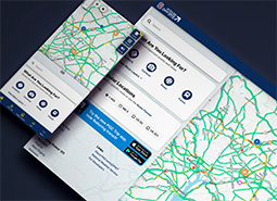
Improving the 511x Dashboard Experience
How can we improve the dashboard?
As part of the 511x redesign, we iterated on the home dashboard to function as a user-focused launching point. Our goal was to quickly guide users to the information they cared about while reducing clutter and improving overall usability.
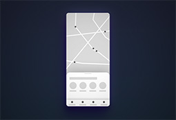
1. Smarter Layer Discovery
Analytics revealed that users often had trouble finding and enabling map layers.
- We streamlined the layer selection process and redesigned the interface to help users more easily find and activate the data they needed.
- We added functionality that allows users to expand the list of layers to view the full set of available options, improving discoverability.
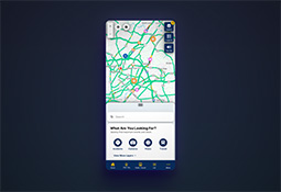
2. Jump to Popular Locations
After reviewing how this feature was used by users and DOT operators, we made the following changes:
- Analyzed search results and discovered that users looked for both specific routes and areas; the previous “Popular Routes” dashboard feature only highlighted routes, revealing a gap in the old system. Used these insights to reorganize and prioritize this dashboard feature to support both routes and areas.
- Enhanced the backend to let agencies quickly add and reorganize popular locations, improving relevance for users during major closures, large events (Super Bowl, Indy 500, World Cup, solar eclipse), and other local situations.
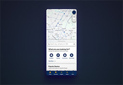
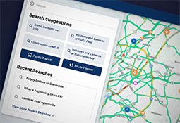
Improving the Search Experience
What challenges did users face with the previous search bar?
Many users were not fully utilizing the power of our natural language processing search algorithm, which limited their ability to find information efficiently.
- I added features to help users better understand the search bar’s capabilities, including button-style suggestions for popular search terms. These enhancements guided and educated users, allowing them to take full advantage of the search functionality.
- The redesigned layout made room for a search history and quick links to favorited searches and locations, making it easier for users to repeat common searches and navigate efficiently.
- We enhanced the hands-free search functionality to be more accurate and accessible. This made the system more convenient for users on the move and more inclusive for those who rely on voice interaction.
Search Results
How did you improve the usability of search results?
- We incorporated an AI-generated summary to help prevent users from feeling overwhelmed by the volume of events returned. This summary provided a clear, concise overview, allowing users to quickly understand the key insights without needing to sift through every result.
- Added small map previews next to each event to improve geographic context and spatial awareness.
- Introduced a layout toggle that lets users switch between list and grid views, providing more control over how they browse and interact with event data.
Event Details
How did you improve the experience of viewing individual event details?
- Redesigned the event details panel to prioritize clarity and readability, organizing information into clear sections.
- Added a map preview directly within the event detail view, allowing users to quickly understand the geographic context without switching screens.