 Adobe XD
 Adobe Photoshop
 Adobe Illustrator
 Visual Studio Code
What is CARS
CARS (Conditional Acquisition and Reporting System), first version built in the early 2000's allows Department of Transportation agencies to create, capture, update, and share traffic events along the designated agencies’ highways. CARS Cloudburst is the latest version of this software.
Goals
I had the pleasure at Castle Rock to work on various Department of Transportation-related products. It was a pleasure to redesign such an important piece of software that helps communicate important information to the public. Some of the goals we set out to incorporate into this new version were to:
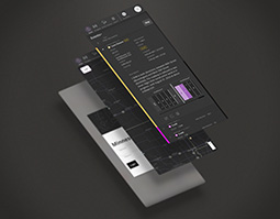
Easily switch between map, hybrid, and table views
A seamless transition between map view, hybrid view, and table view offers a highly versatile user experience, catering to diverse user needs and preferences.
The map view provides a spatial perspective, allowing users to intuitively grasp geographical relationships and visualize locations.
The hybrid view, which combines elements of both map and table, enhances context by integrating spatial data with tabular information, facilitating a more comprehensive analysis.
Meanwhile, the table view offers a detailed, data-centric approach, perfect for users who prefer structured lists and numerical data.
This flexibility in view options ensures that users can easily switch between different formats based on their task requirements, enhancing accessibility and improving overall usability.

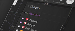
Search and filter events
There are an overwhelming number of events and incidents happening throughout a given county, highway, and state at any given time. How do you sort through them?
Allowing users to apply one or multiple filter criteria to each column, operators can now perform complex queries to filter the desired information.
Responsive for tablets and mobile devices
DOT operators in the field can now effortlessly update public information, including flood warnings, road closures, dynamic message boards, and the status of rest areas, directly from the roadside on their phone, ensuring that the public receives the most current and accurate information.
This capability is crucial for managing traffic flow and enhancing safety, as it provides real-time information that can help drivers make informed decisions. Enabling immediate updates mitigates the impact of road conditions and emergencies on travelers.
Dark and light mode to help reduce eye strain
DOT operations typically occur in dim environments. Light and dark modes are invaluable features that allow operators to adapt their monitors to their surroundings, ensuring optimal visibility and comfort.
In bright environments, a light mode with a lighter color palette reduces glare and eye strain by complementing the surrounding light. Conversely, in dim or dark environments, a dark mode with subdued colors minimizes eye fatigue by reducing screen brightness and avoiding harsh contrasts.
This adaptability not only enhances user experience but also promotes productivity, allowing operators to work efficiently in any lighting condition.
Color System
Consistency is crucial for creating a seamless user experience, especially when supporting both light and dark modes. A well-designed color system should maintain visual harmony hierarchy, and clarity, ensuring a cohesive experience regardless of the chosen theme.
Balancing out the color distribution was an important design consideration. About three-quarters of the color balance consists of various shades of a neutral or monochromatic color, such as grays, which provide a clean and unobtrusive background. This neutral palette helps to focus attention on content, providing a consistent and unified look across different elements and screens.
The remaining one-quarter of the color system balance is further divided into various states, the largest portion of which is the primary action color, which serves as a focal point for user interactions. This color is strategically used to highlight interactive elements such as buttons, links, and other call-to-action components, making them stand out against the monochromatic backdrop. By limiting the use of this accent color, the design maintains visual clarity and prevents overwhelming the user with too many competing elements. This balanced use of color not only enhances the aesthetic appeal of the interface but also guides users intuitively, helping them quickly identify and engage with key actions.
Base
Primary
Active
Success
Warn
Error
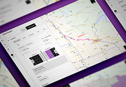
Simplify and Improve Event Creation
The DOT event creation system has been meticulously streamlined to facilitate faster data input and enhance operator efficiency. Designed with keyboard-centric navigation, the system is optimized for quick and accurate data entry, minimizing the need for mouse interaction. This approach reduces the number of fields and options presented at any given time, simplifying the process and allowing operators to focus on essential information.
Moreover, the system supports the creation of a wide variety of event types, including road construction, traffic incidents, and special advisories, such as information on how to navigate around during the Indy 500. The system's versatility ensures that operators can efficiently manage diverse scenarios, providing timely and accurate information to the public.